KIDFITSTRONG.COM
HOME > CASE STUDY > KIDFITSTRONG.COM
EXECUTING
THE STRATEGY
THE CHALLENGE
The challenge put forward by KIDFIT STRONG Momentum required a unique set of skills to achieve the branding, packaging designs, and web development goals of the project. Branding work on the website entailed the creative skills of designers, whereas setting up the ecommerce and informative content domains demanded top-notch web development competencies. The company wanted to create a place where they could display their nutritional products without wanting the user to purchase them for now but in the near future.
THE SOLUTION
PNC Logos initiated this challenge by engaging our web development experts to create the ecommerce and informative content domains. Our innovative designers utilized their out-of-the-box thinking to craft a superb logo that carries the brand values of KIDFITSTRONG Momentum. The designers also furnished attractive designs for product packaging.
The PNC Logos strategy for this project can be categorized into a three-step plan:
1. Developing & Managing their Websites
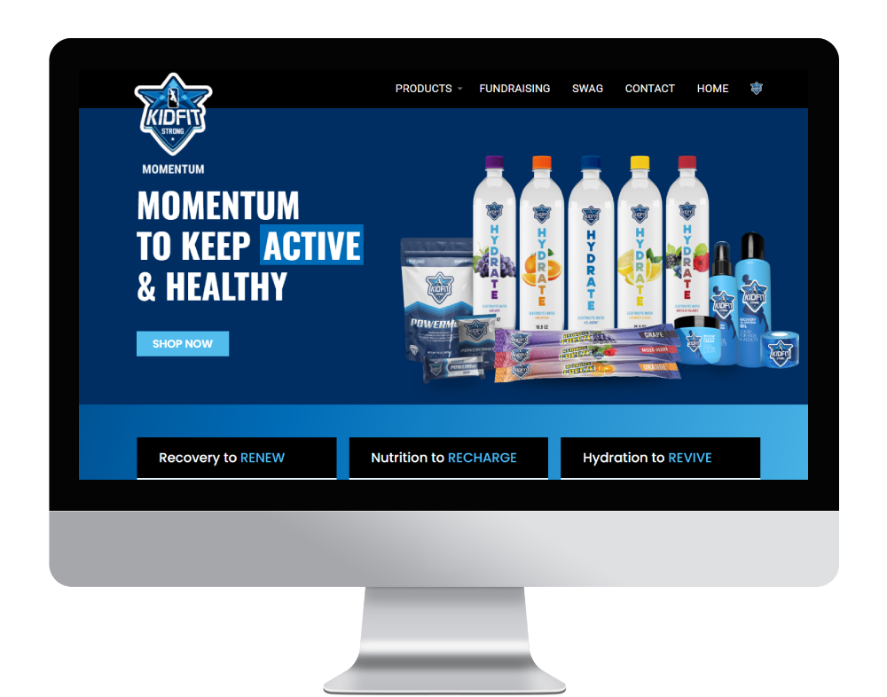
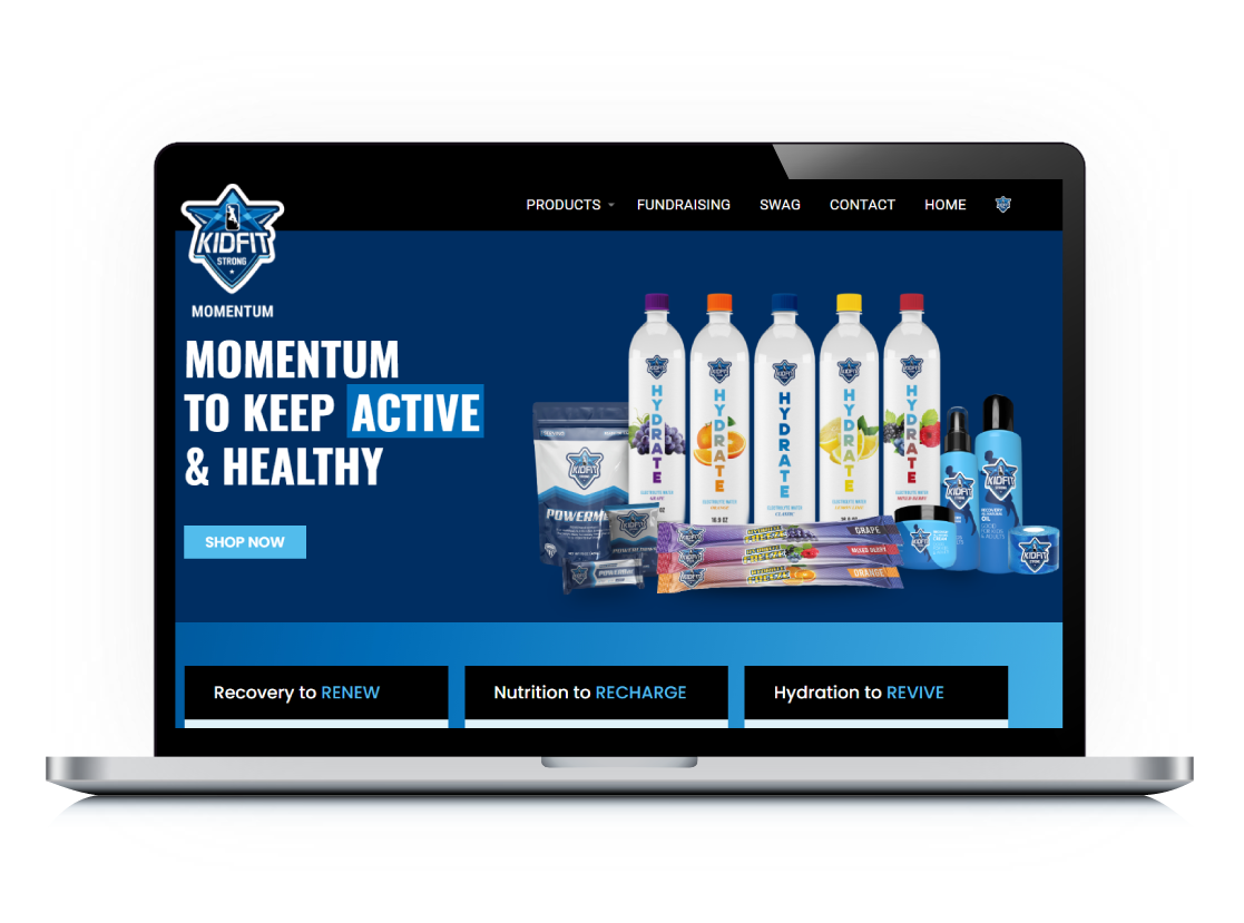
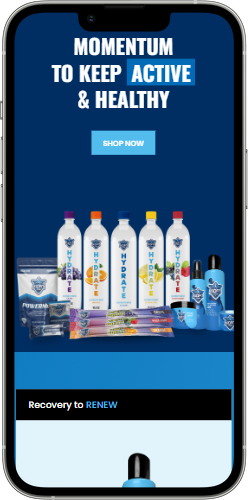
The first step of our strategy involved the creation of two separate domains. The first domain consisted of the ecommerce functionality and company’s products were displayed into four distinct categories: Hydration, Nutrition, Recovery and Swag. A virtual fundraising program option was also incorporated in the ecommerce website. PNC Logos also monitored regular updates to the company’s products and categories.
Another domain was created to post informative content for website audience. This website is used to display all information related to current and future events.
2. Branding
The next step of the plan was to engage our artistic designers and craft a stunning logo for the KIDFITSTRONG Momentum. Event magazine was also a crucial part of the design phase as our skilled designers ensured that the previous, running and upcoming events were displayed emphatically for the online audience.
3. Product Packaging Design
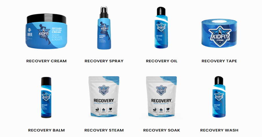
The final step involved the packaging design of products belonging to the Hydration, Nutrition, Recovery and Swag categories.
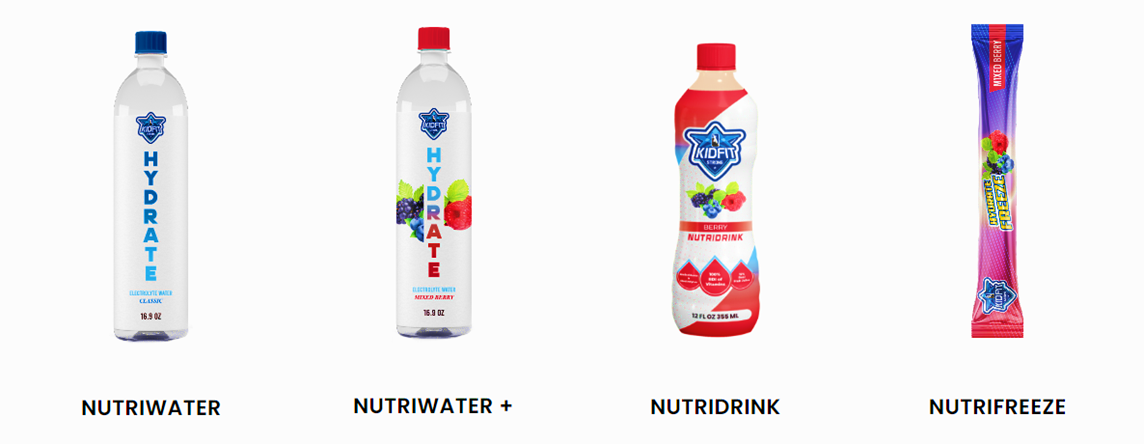
The creative designers at PNC Logos employed a unique combination of colors, fonts and packaging content to craft striking packaging designs. The client was happy and satisfied with the packaging designs in the first go.
GET IN TOUCH
Ready To Work With Us For Web Solutions ?
Start Your ProjectOur Blog

So, you made a sale. But was it the first ad that engaged the customer, the email that built trust, or the final offer that sealed the deal? Without clarity, you will end up spreading your budget too thin across low-impact touchpoints—or overlooking the very tactics that deserve more investment. The result? Wasted ad spend, […]

If you’re finding it harder to win new customers, it’s not because your offering has lost its value — it’s because buyers have become more skeptical. Today, generic ads and cold pitches flood every channel. People only engage when they feel understood and offered something worthwhile. This shift has made it challenging for businesses to […]

You’re running a business and are extremely focused on making a product and selling it or offering a service. All went well in the initial days, but now your business has found its footing, and your customers are expecting more. You hear murmurs about something called a blog, and before you know it, now you’re […]

We have all been there. You know the situation where you are meticulously explaining to the client your well-crafted SEO plan on which you spent countless days, and you think they are in awe of your efforts. But when it’s their time to speak, they disappoint you a bit by asking: “That’s all good, but […]
Get In Touch
Get In Touch


