 June 15, 2026
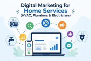
Digital Marketing for Home Services: Complete Guide for HVAC, Plumbers & Electricians
The U.S. home services market is worth $700 billion in 2026, according to McKinsey. And 80% of Americans now search online to find local service providers every week, according to SOCi. As a result, HVAC companies, plumbers, electricians, and other home service businesses face increasing competition for customer attention. Referrals still matter, but they are […]
Read More-
June 12, 2026
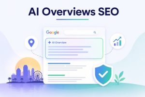
AI Overviews SEO: How To Rank in Google’s AI Answers in 2026
Local search in Orlando is no longer just about getting the highest organic ranking on Google. When someone searches for a local service or asks a related question, Google AI Overviews provide an answer directly on the search results page before users click any website link. Because of this change, AI Overviews SEO has become […]
Read More  May 26, 2026
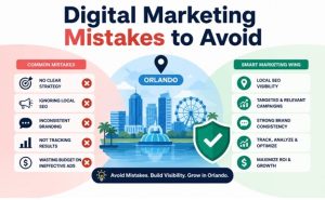
Digital Marketing Mistakes Orlando Businesses Must Avoid
Orlando’s metro area now has more than 2.9 million residents, while the city welcomed 75.3 million visitors in 2024, according to U.S. Census Bureau data. This rapid growth creates strong opportunities for local businesses. However, it also increases competition across every industry. As a result, companies cannot rely on outdated or inconsistent digital marketing strategies. […]
Read More May 25, 2026
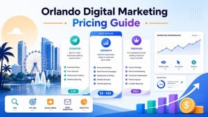
How Much Does Digital Marketing Cost in Orlando in 2026
Orlando’s economy hit $233 billion in 2024, and its business base grew 17.5% in just five years, according to the Orlando Economic Partnership. As more companies are competing for the same audience, partnering with an experienced agency offering Digital Marketing services in Orlando can give you a significant advantage. But before you choose one, it’s […]
Read More May 15, 2026
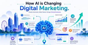
How AI is Changing Digital Marketing for Orlando Businesses
Orlando is home to 2.7 million residents across four counties and is one of the most visited tourist economies in the world. This puts local businesses in direct competition with national brands and franchise operators to stay visible online. The growing use of AI in the digital landscape has made this competition even harder to […]
Read More May 10, 2026
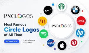
50+ Most famous circle logos: Best Circular Brand Identities
Circular and round shapes in logo design are favored for their psychological appeal, aesthetic balance, practical versatility, and cultural symbolism. They offer a blend of simplicity, universality, and visual impact that makes them effective across various contexts and media, contributing to their popularity in branding. There is a long list of famous circle logos that […]
Read More May 07, 2026
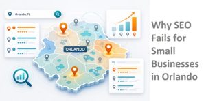
Why Most Small Businesses Fail at SEO in Orlando
Orlando ranked #1 in the United States for the best business growth at 6.2% by OnDeck. This means new businesses are opening faster in Orlando, which points towards higher local competition to rank on Google. This does not mean you need a larger budget to stay visible to potential customers. You only need to avoid […]
Read More May 06, 2026
Logo Design Inspiration for 2026
In modern branding, simplicity has become one of the most powerful design principles. Businesses today need logos that are memorable, scalable, and instantly recognizable across websites, mobile apps, social media platforms, and digital advertisements. This is why minimalist branding and custom logo design continue to dominate branding trends in 2026. A well-designed logo is more […]
Read More May 04, 2026
Text Logos vs Abstract Logos, What’s the Difference?
Your logo is the single most visible element of your brand. Whether it appears on a website, a storefront, a mobile app icon, or a product label, it needs to communicate instantly and memorably. With so many logo styles available, two categories tend to dominate the conversation: text-based logos and abstract or symbolic logos. Quick answer: Text logos […]
Read More
Get In Touch
Get In Touch


