 July 26, 2024
How to copyright logo design of your brand
We all have seen a © sign in books, photographs, songs, paintings, and several other things that are original creations of an individual or a group. While encircled “c” might look small on huge posters and covers, it wields immense power. It is your safety net in case someone tries to steal your work. Like […]
Read More June 27, 2024
Red vs blue logo: A deep dive into how to choose the right color for your brand
In the world of logo design, two of the most popular colors are red and blue. Think about memorable logos, and most of them would either be red or blue – fully or with splashes of either of the two colors. The debate about a red vs blue logo has been raging since the era […]
Read More-
May 16, 2024
TikTok Ads: 5 Tips for Boosting Your ROI
Are you ready to skyrocket your TikTok ad results without blowing your budget? Then you’re in the right place. TikTok has taken the social media world by storm, and savvy businesses are cashing in on this viral video app’s huge potential to drive sales. But making your ads stand out in a sea of lip […]
Read More  April 25, 2024
Cheap vs expensive logo: How much you’d spend on designing
It is just a logo. We have heard and seen people not giving logos the respect they deserve. You can’t trivialize something that becomes the face of a brand and gets etched in people’s minds. According to research by Renderforest, logos hold a significant value as the most recognizable brand identifier. But given the immense […]
Read More-
April 17, 2024
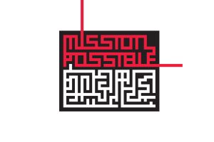
14 hidden logo messages you would never have noticed
Creativity is boundless. There is no end to the imagination of the human mind. One of the features of creativity is that, in most cases, it is not overt. The messaging, the idea, and the thought behind these masterpieces are often subtle so that people can extract their own meaning from them. Most modern-day logos, […]
Read More  March 31, 2024
7 Modern Logo Examples That Are Design Masterpieces
I say great logos, and you hear Apple, Google, Nike, Starbucks, FedEx, etc. You’re right. They are all masterpiece logos. Be it in New York or Sydney, consumers around the world instantly recognize them. They have built a brand value that’s hard to break. In these logos or any other logo in the world, there […]
Read More February 27, 2024
Benefits of Facebook marketing you must reap in 2024
In 2024, Facebook marketing evolves with AI, VR, and hyper-personalization. Discover how businesses are venturing into the metaverse, retailing virtual goods, and creating immersive experiences to engage audiences like never before. Are you ready to harness the future of marketing?
Read More February 20, 2024
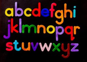
Step-by-step-guide on how to choose the best colors for logos
Explore the art of choosing the perfect colors for your logo with our step-by-step guide. Dive into color psychology, understand color relationships, and discover the best color combinations for logos in 2024. Whether it’s creating contrast, conveying emotions, or targeting specific industries, find the ideal colors to represent your brand and captivate your audience.
Read More-
January 23, 2024
How to Combine Elements of Logos to Create a Masterpiece
Let’s begin this one with our idea of a striking logo. We all love logos; we see them on anything and everything. Some of them leave us smitten, and others we forget even a second after seeing them. So, we all have a fair bit of an understanding of the elements of logos that make […]
Read More


Get In Touch
Get In Touch


