 March 11, 2025
10 Creative Marketing ideas for holiday season
The online marketing space is brimming with energy and competition, which at every point provokes web designers and online retailers to employ creative ideas and social media strategies to bring the traffic on board. This constant need for flexing the creative muscle is no different in holiday season which is the high time for driving […]
Read More February 26, 2025
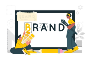
How to Create Brand Guidelines? A comprehensive Guide
Did you know keeping your brand consistent can boost your revenue? It’s true! Your brand is more than just a logo—it’s how you show the world what you stand for. Consistent branding helps build trust and creates a strong emotional connection with your customers. In fact, data from Blogging Lift reports that 82% of customers […]
Read More-
February 14, 2025
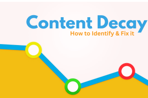
What is Content Decay? Here’s How to Identify & Fix It
We’ve all been there—dedicating time and resources to create a solid piece of content. Only to watch it gradually lose organic traffic and conversions. That’s content decay in action! It is the fate every piece of content has to face, no matter how well it performs initially. But the good news is your content is […]
Read More  January 29, 2025
How to Design the Right Type of Logo for Your Brand
Thinking of creating a logo? As the cornerstone of your brand identity, it needs to be spot on. A logo should encapsulate the personality and values of your brand with a single visual. Whether you choose a simple, sleek design or a detailed artistic emblem, your logo needs to tell a story. So, how do […]
Read More January 15, 2025
Game-Changing Graphic Design Tools of 2025
Stunning design obtained from a powerful graphic designing tool (Source: Unsplash) As a graphic designer, having the right graphic design tools at your disposal can make all the difference in your work. Whether you are creating designs for print or digital media, a variety of software and online tools can help you create professional-looking designs […]
Read More January 08, 2025
Cracking the Secret Code: The 4 Cs of Social Media Marketing
According to Backlinko, over 5.17 billion people use social media across the globe. More importantly, 77% of consumers prefer to purchase from brands they follow on social media, as per WiserNotify. Needless to say, social media marketing (SMM) is crucial for your success. But it’s not merely about creating an account and posting viral content. […]
Read More-
December 27, 2024
Design ideas for fast food restaurant logos that evoke customers’ appetite
The most important thing in the fast food business is the taste. But taste alone can only get you so far. You can tell people about the good taste only after they step into your restaurant. But how do you bring them to your restaurant? This brings us to the second most important thing in […]
Read More -
December 10, 2024
The Secrets Behind A Call To Action Button that Converts Visitors into Customers
A Call to Action (CTA) is the gateway to conversions. Whether you’re encouraging visitors to make a purchase, sign up for a newsletter, or download an ebook, your CTA plays a pivotal role in guiding them toward taking the desired action. But not all CTAs are the same. A well-crafted CTA can make the difference […]
Read More -
November 27, 2024
Custom vs AI-Generated Logos -What’s Best for Your Brand?
Data by Market Research Biz shows that 75% of consumers can identify a brand by its logo and 60% by its visual style. Needless to say, your logo is a crucial component of your success. A well-designed logo shows professionalism, building consumer trust. And it helps boost recognition, enabling customers to remember the brand easily. […]
Read More


Get In Touch
Get In Touch


