 April 10, 2026
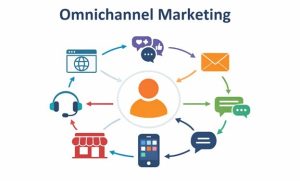
Omnichannel Marketing Strategy: Why It Matters Most in 2026?
The modern customer journey is fragmented across multiple channels. A customer may first see your product on TikTok, then research it on their computer, and finally visit your store in person. If your channels aren’t connected and consistent, your brand fails to resonate at half those touchpoints. An omnichannel marketing strategy solves this problem. It […]
Read More March 31, 2026
SEO for Electricians: The 2026 Guide to Rank Higher & Win More Local Jobs
The top 3 organic search results receive 68.7% of all clicks on Google, according to FirstPageSage. Businesses outside the top 3 are left competing over the remaining fraction of traffic. SEO for electricians helps you reach those top positions. It increases your visibility, builds trust with potential customers, and generates leads. But how does SEO […]
Read More-
March 30, 2026
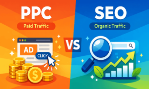
PPC vs. SEO: What’s the Difference and Which One Does Your Business Need?
Should you invest in SEO, run paid ads, or do both? It’s one of the most consequential decisions in digital marketing. That’s because search engines are where customers go when they’re ready to act, and your visibility there directly shapes your growth. PPC vs. SEO sits at the center of this decision. Both are powerful. […]
Read More  March 24, 2026
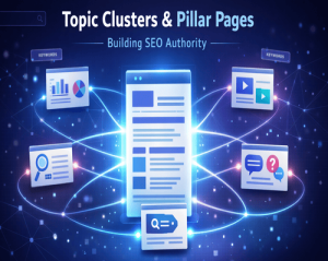
What are Topic Clusters and Pillar Pages & How They Build SEO Authority
Topic clusters can increase your organic traffic by about 30%. They also help your search rankings last 2.5 times longer, according to Hire Growth. But why? Topic clusters and pillar pages not only improve your site’s structure but also boost your topical authority. As a result, search engines see you as an authoritative figure in […]
Read More-
March 17, 2026
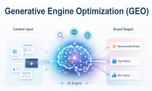
What is Generative Engine Optimization & How to Appear in AI Searches
Today, 25.11% of Google searches show an AI-generated answer directly on the results page, as per a Conductor 2026 Article. And Google isn’t the only place people search anymore. Millions now ask AI tools directly. ChatGPT alone gets over 5 billion monthly visits and ranks as the fifth most-visited platform globally, according to SEMRush Data. […]
Read More -
February 27, 2026
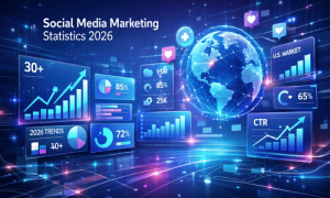
30+ Latest Social Media Marketing Statistics for 2026: The Data Every U.S. Marketer Needs
Millions of Americans are on social media in 2026. And they’re not mindlessly scrolling. They’re using social media to intentionally discover, research, and buy. Successful social media marketers align their strategies with this behavior. In fact, 79% of marketers use social media content (organic and paid) as part of their overall marketing strategy, according to […]
Read More -
February 24, 2026
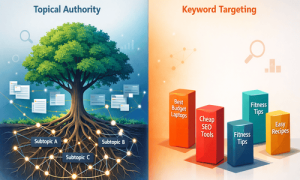
Topical Authority vs Keyword Targeting: Which SEO Strategy Wins in 2026?
Imagine two competing websites in the same niche. One has over 50 blog posts, each targeting a single keyword. The other publishes half as much but links every post around a central topic. Six months later? The second site still ranks on page one. The first? Ranked and disappeared. That’s the whole essence of the […]
Read More -
February 20, 2026
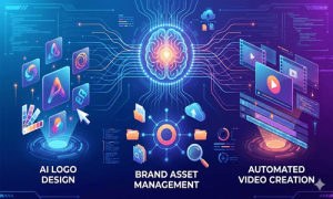
8 Best AI Branding Tools for Small Businesses in 2026
For small businesses, building a strong brand identity can be financially exhaustive. Yet without a strong visual identity and consistent messaging, how do you compete with deep-pocketed rivals in crowded markets? Artificial intelligence has made this much easier. Emerging AI tools for branding have made professional-quality brand assets and management accessible at a fraction of […]
Read More -
February 09, 2026
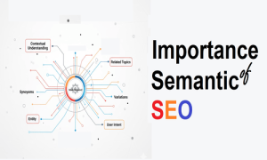
The Importance of Semantic Keywords in SEO
Gone are the days when search engines just matched exact words. Today, Google understands the meaning behind a search, how different ideas relate to it, and what the user actually needs. Because of this, modern SEO isn’t just about using the right keywords. Businesses now rely on semantic SEO services to build content that aligns […]
Read More
Get In Touch
Get In Touch


