
Let’s begin this one with our idea of a striking logo. We all love logos; we see them on anything and everything. Some of them leave us smitten, and others we forget even a second after seeing them. So, we all have a fair bit of an understanding of the elements of logos that make them memorable – striking colors, simplistic and ingenuous design, harmonious typography, and synergy with the brand’s identity.
It is one thing to know about what makes a striking logo and totally another to combine all these elements to design a memorable logo. This process, from conception to design, has a lot of in-betweens. This blog will delve deeper into it so you get all the insights you might need to come up with the next big thing in the logo world.
The coming together of elements of logos
In this part, we will not look for the answer to ‘what are the elements of a logo?’ Rather, we would build an understanding of how these elements combine to create a branding identity that can be recalled in microseconds.
The synergy of shape and symbol
The shape and symbology in a logo are a lot more than getting a circle and overlaying text over it. This process involves what we call shape psychology. Shapes are integral in logo design as different shapes are perceived differently and evoke a different type of response.
Have you ever wondered why you very rarely find a fast-food brand, coffee shop, or restaurant with square logos? It is because of the perception of squares, rectangles, or other shapes with edges.

This is because roundedness is associated with being approachable, friendliness, and harmony while angular shape is associated with energy, toughness, and strength.
Food brands want to give an impression of joy and affability. Therefore, their logo and typography have more roundedness as compared to the logos of companies operating in other sectors.
Symbols can be literal illustrations of your brand’s offerings or metaphorical representations of its values. Think of the dove for peace, the apple for knowledge, or the Amazon arrow for speedy delivery, which is also perceived as the smile of a happy customer after receiving their parcel.
![]()
Symbolic resonance is the lifeblood of a logo. Think of it as a spark that ignites deeper meaning and emotional connection beyond the surface level. It’s the hidden language that whispers your brand’s story, the subtle cue that triggers associations and memories in the viewer’s mind. Let’s unpack this powerful concept even further:
- Literal vs. figurative: A symbol can have a literal meaning – think of a hammer for a construction company – or a metaphorical one – think of a phoenix for a brand striving for constant renewal. Explore both avenues to find the layer of meaning that resonates most deeply with your brand.
- Cultural layers: Symbols often carry different meanings and connotations across cultures. Often, brands change their logos to better align with the cultural sensitivities of the different countries they are operating in. It is important to research the potential interpretations of your logo to avoid unintended implications and ensure your message transcends geographical boundaries.
- Historical echoes: Consider tapping into historical or mythological symbols that align with your brand’s values. The Nike swoosh draws inspiration from the victory goddess Nike, while Starbucks invokes the mermaid legend with its siren symbol.
It is important to understand that shapes and symbolism are not exclusive. A fitting logo must have the shape-symbol fusion where they merge seamlessly, to multiply the impact of logo recognition.
Research has found that in comparison to symmetrical logos, asymmetrical logos — those consisting of halves that are not perfectly mirrored along — tend to be more arousing and thus help to build the perception of the brand as exciting.
Think about the FedEx arrow formed by negative space within the “E” and “x” or the Pirelli “P” embedded within the tire tread. These are some of the best examples of the symbol-shape synergy where an added meaning is conveyed just by their ingenious fusion.
Here are two ideas to help you while brainstorming the shape-symbol fusion:
- Abstraction and evocation: Don’t be afraid to use abstract symbols that leave room for individual interpretation. This can spark curiosity and ignite personal connections with your brand. Think of the Apple logo, a bitten fruit open to a multitude of interpretations.
- Subtlety and suggestiveness: Overt and literal symbols can feel heavy-handed. Choose symbols that subtly suggest your brand’s essence, prompting viewers to discover meaning for themselves. The Adidas three stripes, for example, hint at movement and progress without being overly literal.
The orchestration of color and contrast
Logos are nothing but an interplay of color psychology. They are one of the most vital elements of a logo design. A memorable logo has all its colors in harmony to create visually pleasing and impactful compositions. They add depth and dimensionality and work as the invisible conductors of a logo’s visual symphony. They can guide the eye, highlight key elements, and evoke powerful emotions.
The emotional power of palette: Different colors carry distinct emotional associations. Red exudes passion and excitement, blue instills trust and reliability, while green speaks of growth and balance. The right palette aligns with your brand’s personality and the emotions you want to evoke.
When it comes to hues, you need to understand the basics of color theory, which is sort of an explanation of how to use the right colors to evoke the right kind of responses.
To understand this, you have to recall a lesson you learned in primary school: There are three types of colors:
- Primary
- Secondary
- Tertiary
Primaries are colors that cannot be created by combining two colors. Secondary colors can be created by combining colors, and Tertiary colors are created by mixing a primary color with a secondary color.
Now, why is this important? When you are exploring color harmonies for logos, you not only have primary, secondary, or tertiary colors, but also a wide palette that includes the light and dark shades of these colors.
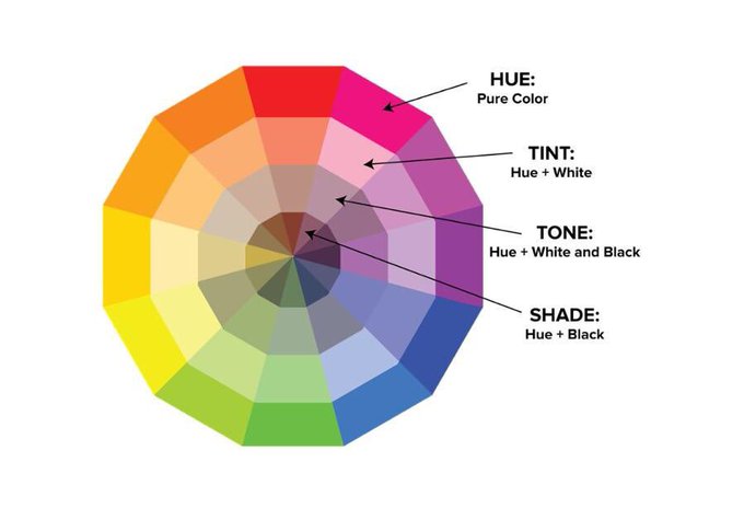
Choosing one color from this extended wheel is no simple task. However, you can experiment with a different combination, like complementary (opposites on the color wheel), analogous (neighboring colors), or triadic (three equidistant colors), to create visually pleasing compositions.
Use color contrast strategically to guide the viewer’s eye and establish visual hierarchy. Highlight key elements like your brand name or a central symbol with bolder colors or higher contrast ratios.
For contrast, use the negative space. It can enhance legibility, emphasize design elements, and create a sense of openness and sophistication. The Apple logo owes its striking impact to the generous negative space surrounding the bitten apple.
You can also use:
Value contrast: The difference in light and dark values plays a crucial role in legibility and hierarchy. Use high contrast for your logo’s primary elements, like the brand name or symbol, to make them stand out.
Color contrast: The strategic use of contrasting colors can direct the viewer’s eye and create visual interest. Think of the FedEx logo, where the orange arrow pops against the blue background, guiding the eye toward the brand name.
Gradients and textures: Introduce subtle gradients or textured effects to add depth and dimension to your color palette. Consider the brushed metal texture of the Ford logo or the gradient sky hues of the National Geographic logo.
The bond of typography and form
Font choice isn’t just about aesthetics; it’s about expressing personality. Serif fonts exude tradition and elegance, while sans-serif fonts convey modernity and clarity. Script fonts can inject warmth and creativity, while geometric fonts add a touch of futurism.
The relationship between typography and form in a logo is much more than choosing a pretty font and slapping it next to a shape. It’s a delicate, intricate dance where each element complements, amplifies, and ultimately defines the other.
![]()
Fonts should be in symphony with your symbols, colors, and shapes. Contrast your shapes and fonts to create visual tension and intrigue. A bold, geometric shape paired with a delicate script font can spark curiosity and make your logo stand out. Remember, tension needs release, so ensure your contrasting elements ultimately balance and harmonize.
But, don’t use too many fonts. Use one for your brand name and the second for the tagline. Play with how your letterforms interact with each other. Do they stand tall and independent, or do they lean in gracefully, supporting each other in a harmonious embrace? Consider spacing, kerning, and weight to create typographic harmony and avoid visual dissonance.
Your logo’s typographic and formal dance should not exist in isolation. Ensure it translates seamlessly across all brand touchpoints, from your website and packaging to your social media and marketing materials. Maintain a consistent typographic and formal language across all platforms to strengthen brand recognition and solidify your visual identity.
The layers of texture and effect
Logo is all about subtlety – the subtlety of textures, the subtlety of gradients, the subtlety of shadows, basically, the subtlety of everything.
A seamless blend of colors and gradients can create depth, movement, and visual interest. Strategically placed shadows create a sense of depth, making elements appear to lift off the surface. They can add a touch of realism or suggest a sense of mystery and intrigue.
![]()
See the Netflix logo to understand how an interplay of textures can add depth. It is just a standalone N, but the use of texture and design makes it look like it has an added dimension.
To come up with such a brilliant creation, think about the materials your brand works with or aspires to. Can you subtly infuse those textures into your logo? A fashion brand might incorporate fabric-like textures, while a tech company might utilize metallic or circuit-board patterns. Use mirrored surfaces or glossy reflections to add a touch of luxury and sophistication.
Play around with special effects like transparency, reflections, or 3D elements to create a unique and memorable logo.
The union of style and context
When a logo truly shines, it’s not just a pretty picture; it’s a perfectly choreographed dance between its chosen style and the context it inhabits. It is a place where everything – font choice, color palette, symbolism – complements and amplifies the other, seamlessly integrating with the brand’s story and target audience.
Different industries have established visual languages. Tech logos might waltz with geometric shapes and sans-serif fonts, while luxury brands embrace elegant serifs and rich color palettes, engineers and construction companies might use tools and cogs for symbology.
Recognizing these norms provides a foundation, but don’t be afraid to add your own creative flair. While you should be mindful of these norms, a bit of deviation might result in a striking product. Remember, true artistry lies in pushing boundaries gracefully. Think of Airbnb’s playful, hand-drawn logo that stands out amongst corporate giants in the hospitality industry.
Conclusion
As brands’ narratives evolve, so should elements of logos. A well-designed logo has the flexibility to adapt, retaining its essence while subtly incorporating new elements that reflect your brand’s growth and journey. All elements of a good logo stand in a harmony and harmonious union of style and context. A logo that understands its environment, caters to its audience and embodies its brand’s soul is a logo that leaves a lasting impression and becomes a beacon of brand identity.


