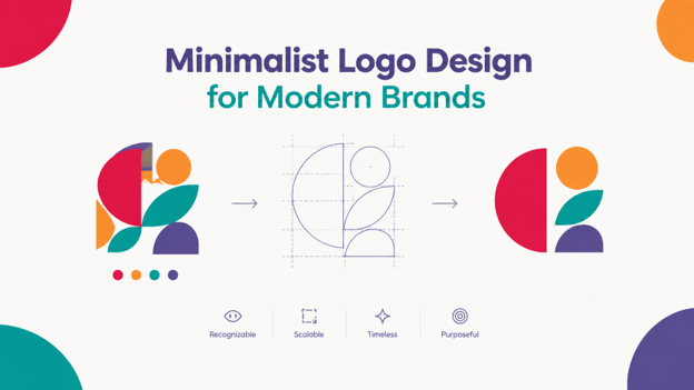
A minimalist logo uses only the essential shapes, colors, and typography needed to represent a brand. Its simple design makes it easy to recognize across websites, social media, packaging, and other platforms. Modern brands prefer this minimalism to stand out in crowded digital spaces.
This article explains what defines a minimalist logo design, why this approach works, and when it makes sense for a brand. If you are considering a simpler logo, working with professional logo design services that combine strategic planning with custom design can help you create a logo that aligns well with your brand’s core identity.
What Is a Minimalist Logo?
A minimalist logo is a brand mark that uses only the essential shapes, colors, and typography needed to communicate a brand’s identity clearly. Its clean design helps people recognize the brand quickly across websites, packaging, social media, and other marketing materials.
Minimalist logos are sometimes called simple logo designs, but the two are not exactly the same. A simple logo is any clean, easy-to-read design without unnecessary clutter. A minimalist design follows a stricter “less is more” approach. Every design element must serve a clear purpose, whether it communicates the brand’s personality, improves readability, or makes the logo easier to recognize.
This focus on essential elements makes minimalism the logo design inspiration for modern branding in 2026. With fewer shapes, colors, and details, these logos are easier to scale, reproduce, and use across different platforms.
Characteristics of a Minimalist Logo Design
Minimalist logo design uses a few carefully chosen elements to create a clear and recognizable brand mark. Below are the key elements of a logo built on minimalist design choices.
- Simple shapes and forms. Geometric shapes, clean outlines, and continuous lines replace complex illustrations. This keeps the logo clear and recognizable at different sizes.
- Strategic negative space. Empty areas can create hidden shapes, secondary meanings, or subtle visual details. This adds interest without crowding the design.
- A limited color palette. Minimalist logos usually use black and white, a single color, or two primary colors. A limited palette keeps the design clean and makes the logo easier to recognize.
- Restrained typography. Simple geometric sans-serif or classic serif fonts work well for minimalist designs. Font weight, size, and letter spacing help create a clear visual identity without decorative type effects.
- Few or no decorative elements. Minimalist brand marks avoid unnecessary gradients, textures, shadows, and ornaments. This keeps attention on the main symbol, shape, or wordmark.
- A clear visual hierarchy. The main element should attract attention first. Whether it is a symbol, letter, or shape, the viewer should understand the logo at a glance.
- Instant recognizability. These elements work together to create a logo that remains clear across different sizes and formats. The design should look just as recognizable on a billboard as it does on a smartphone screen.

Why Minimalism Matters in Modern Branding
Today, your logo needs to work almost everywhere. It may appear in a website header, mobile app, packaging, business card, or storefront sign. That makes minimalism more than a style choice. It is a practical way to keep your brand recognizable across different sizes and formats.
This matters even more as people spend more time on mobile devices. As of mid-2026, mobile devices account for over 50% of global web traffic, according to StatCounter’s Global Stats. So, many people first see your logo as a small icon. If it only looks good at a large size, it can lose its impact when reduced to a mobile browser tab or app icon.
Minimalist logos also tend to age well. Their simple forms need fewer changes as design trends evolve. As a result, they can stay familiar and memorable for years. That lasting appeal helps explain why so many brands have moved toward flat logo design over the past decade.
Key Benefits of a Minimalist Logo Design
A minimalist logo does more than look clean. By focusing on essential elements, it can improve brand recognition, work across different platforms, and stay relevant as your brand grows.
Stronger Brand Recognition
A logo with fewer elements is easier to process and remember. A 2024 study published in SHS Web of Conferences found that reducing visual complexity improved brand recognition and helped people better remember and associate a logo with a brand, especially online. Google’s logo evolution shows how this approach can work over time.

Modern Professional Look
Clean forms and limited detail can give your brand a more current and trustworthy appearance. On the other hand, overly detailed designs can quickly feel dated. Facebook logo, for example, has been refined over time while keeping its core identity recognizable.

Scales Across Platforms
Your logo needs to look good everywhere. A minimalist mark can stay clear and legible as a 16-pixel favicon or a large storefront sign. This flexibility makes simple designs practical for today’s digital and physical brand environments. And we see this clearly across modern logo examples from the past few years.
Clear Brand Messaging
When you remove unnecessary visual noise, the key elements get more attention. A shape, color, or symbol can communicate your brand identity without competing with other details. Siegel+Gale’s 2026 simplicity research found that 76% of consumers are more inclined to recommend a brand that provides a simpler experience.
Greater Design Flexibility
Simple logo designs are easier to adapt across backgrounds, colorways, and print materials. For example, simple geometric shapes, like the ones behind many famous circle logos, can work in full color, a single color, or reversed against a dark background without losing their identity.
Supports Long-Term Branding
A simple design is easier to refine as your brand evolves. You can make small updates without starting over with a complete rebrand. In addition, choosing a clear direction from the beginning, such as a text logo or abstract logo, also gives you a strong foundation for future design changes.

What Makes a Minimalist Logo Effective
Minimalism works well when you remove unnecessary elements while preserving the brand’s core identity. Simply reducing the number of shapes, colors, or details can leave you with a generic symbol instead of a strong brand mark.
Here are the golden rules of logo design for creating a minimalist brand mark.
Distinctive Shapes
A minimalist logo should have a shape that people can recognize without relying on color or text. Its silhouette should also look different from competitors’ logos. This makes the logo identifiable across different sizes and applications, from a website icon to printed materials.
Balanced Typography
Typography becomes more important when a logo has fewer visual elements. The font, letter spacing, size, and weight all need to work together. These choices also depend on the types of logo you’re going for, such as a wordmark, lettermark, or combination mark. Well-balanced typography keeps the design clear while giving the brand a distinct visual character.

Strategic Use of Color
Minimalist logos use a limited color palette, often one or two colors. Each color should have a clear purpose and fit the brand’s identity. With fewer visual elements, the color choice has a greater impact on how the logo looks and feels. A thoughtful palette designed around logo color psychology can make a simple logo more recognizable without adding unnecessary detail.
When Is a Minimalist Logo Right for You
A minimalist logo can be a great fit if you need a design that works well across digital platforms, scales easily, and feels modern. Here are a few signs it may be right for your brand:
- You want a simple logo that stays clear on apps, social media, and small screens.
- You need a logo that scales clearly from tiny favicons to large billboards.
- You’re looking for clean shapes that make your brand easier to understand and remember.
- You want a timeless design that is easier to adapt as your brand grows.
- You want to communicate competence and reliability in industries such as technology, finance, and modern services.
Final Words
In the end, a minimalist logo is all about making intentional design choices. The goal is to communicate your brand’s message and purpose clearly across every screen and surface. Striking that balance takes an experienced eye, and professional guidance can make all the difference.
At PNC Logos, we build custom, strategy-first logos that give your brand a clear and memorable identity. We research your industry, competitors, and audience to create a design that fits your brand and connects with the people you want to reach. Your logo is the first thing customers see, so make it count. Reach out to us today to create a logo designed to represent your brand with purpose.